Brand Story
ConBook was born from a simple belief: events should feel effortless.
Our Origin
In a world of endless forms, clunky payments, and chaotic check-ins, ConBook steps in as the bridge between organizers and attendees. We believe technology should enhance human connection, not complicate it.
Our Symbol
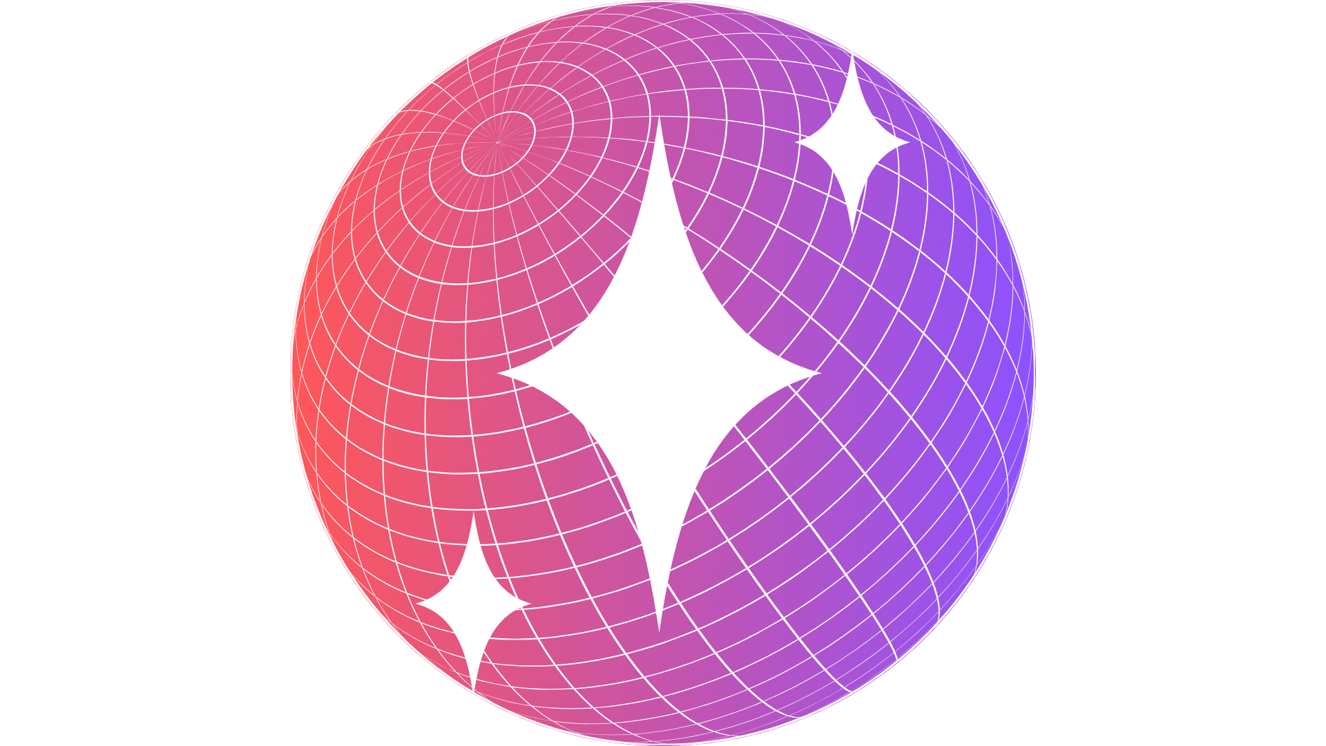
Our logo — a shimmering gradient sphere with stars — symbolizes connection, celebration, and possibility. The sphere represents the global nature of events, while the stars reflect moments of magic.
View Logo Guidelines →Our Purpose
ConBook isn’t just a tool. It’s the spark that makes every event shine brighter. We transform complex event management into seamless, delightful experiences.
Mission & Vision
Mission: To simplify event management through seamless registrations, smart check-ins, and inclusive payment solutions.
Vision: To become the go-to platform for every organizer, from schools to global conferences, making events more accessible, connected, and human-centered.
Logo Guidelines
Our visual identity centers on the gradient sphere — a symbol of connection and celebration.

Primary Logo
Full ConBook logo

Monochrome Light
For dark backgrounds

Monochrome Dark
For light backgrounds

Icon Only
Sphere with star motif
Do’s
- Keep clear space equal to height of “C”
- Use on clean, contrasting backgrounds
- Maintain aspect ratio
- Use approved color variations
- Ensure minimum size of 24px
Don’ts
- Stretch, distort, or skew logo
- Change colors or add effects
- Place on cluttered backgrounds
- Use low-resolution versions
- Recreate or modify elements
Examples & Usage
See how CTAs, accent elements, and glass morphism work in practice.
Call-to-Action Examples
Accent Elements
Status Badges Live
Event status, user roles, or feature highlights
List Indicators
Bullet points and list items with gradient dots
Special Features
Highlight special events or premium features
Sparkle animations for celebration moments
Glass Morphism Usage
Standard Glass Cards
5% white opacity with 10px blur. Perfect for content cards, feature boxes, and information panels.
Glass Modal/Dialog
8% opacity with 25px blur for overlays, modals, and important announcements.
Usage Guidelines
Primary Gradient CTAs: Use only for main actions (1-2 per page). Reserve for “Register”, “Sign Up”, “Get Started” type actions.
Glass Elements: Layer different opacities – lighter glass (3-5%) for backgrounds, medium (5-8%) for cards, stronger (8-12%) for modals.
Accent Elements: Use gradient sparingly – badges for status, dots for lists, lines for section breaks. Never overuse.
Color Palette
Glass gradient system reflecting energy, modernity, and trust.
Primary Gradient
#FF4B2B → #7D3FFF
Gradient Start
#FF4B2B
Gradient End
#7D3FFF
Deep Black
#0a0a0a
Pure White
#FFFFFF
Typography
Clear, modern, and highly legible type system using Inter font family.
Headlines & Titles
Inter Bold (700-800) • Large scale • Minimal line height
Section Headers
Inter Semi-Bold (600) • Medium scale • Clean spacing
Body Text & Descriptions
Inter Regular (400-500) used for all body content, ensuring maximum readability across devices. Line height set to 1.6-1.7 for comfortable reading experience. This text maintains clarity whether displayed on glass surfaces or solid backgrounds.
Small text for captions, labels, and secondary information maintains the same font family for consistency.
Headlines
Font: Inter Bold/Extra Bold
Weight: 700-800
Usage: Hero titles, page headers, section titles
Body Text
Font: Inter Regular/Medium
Weight: 400-500
Usage: Paragraphs, descriptions, UI text
UI Labels
Font: Inter Medium/Semi-Bold
Weight: 500-600
Usage: Buttons, form labels, navigation
Visual Elements
Supporting graphics that enhance the glass gradient aesthetic.
Stars & Sparks
Used as micro-interactions and accent elements. Represent moments of celebration and achievement. Apply sparingly to avoid visual clutter.
Glass Spheres
Background elements that echo the logo. Use with subtle gradients and blur effects to create depth without overwhelming content.
Connection Lines
Subtle grid patterns and connecting lines that suggest networks and global reach. Keep opacity low (10-20%) for background use.
Brand Voice & Tone
Friendly, professional, and celebratory — making every interaction delightful.
Friendly & Professional
Approachable yet reliable. We’re the helpful friend who gets things done efficiently and with care.
Clear & Concise
No jargon, always easy to understand. We respect our users’ time and intelligence.
Celebratory
We highlight the joy of events and human connection. Every interaction should feel positive.
Voice Examples
Before
Complete your registration
Error: Invalid QR code
Payment processing failed
After
You’re almost in! Just confirm your spot ✨
Oops! That QR doesn’t match this event. Try again 💡
Let’s try that payment one more time 🔄
Brand Applications
How ConBook’s glass gradient system works across all touchpoints.
Mobile App
Glass cards, gradient CTAs, star micro-animations
Web Platform
Dashboard UI, event pages, registration flows
Digital Tickets
QR codes with gradient frames, glass backgrounds
Email Templates
Confirmation emails, event reminders, newsletters
Social Media
Instagram stories, LinkedIn posts, Twitter graphics
Merchandise
Staff lanyards, event badges, promotional items
Print Materials
Posters, flyers, business cards, event programs
Event Signage
Check-in displays, directional signs, stage backdrops
Implementation Guidelines
Digital First: All applications prioritize the glass morphism aesthetic with proper blur effects and transparency.
Gradient Usage: Reserve the primary gradient for logos and primary actions only. Use glass effects for UI elements.
Print Adaptations: When glass effects aren’t possible, use subtle drop shadows and the gradient sparingly on key elements.
Accessibility: Always maintain WCAG AA contrast ratios, especially when using glass effects over images or gradients.